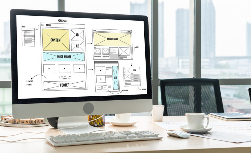
The website should first and foremost comply with the requirements for universal design. Here are some guidelines in the form of where the logo and navigation/menu should be placed. Logo/name at the top, with the menu at the top right or left. This may vary on mobile, but on desktop we recommend placing the logo on the left and the menu on the right.
structure
You should also think about structuring your content in a clear way. Nowadays, many people can be overwhelmed by a lot of text, so short paragraphs, headings and good use of images will count positively.
Design
Your website should follow the visual profile of your company. If you don’t have a graphic/visual profile, you should either get help to create one (if you build the website yourself), or get a professional to build your website, who can then look at what you have today in terms of graphic material, and build the visuals on the website in the same style. The text should be appropriately sized, i.e. not too big and not too small. This means that you often have to set different text sizes depending on the screen size. Speaking of screen size, the design should be flexible depending on the size of the user’s screen. You need to check how elements, text and images look on different screen sizes. The design must work on both large and small screens. Colors should be used consciously. Make sure to highlight important buttons and links with the same color. Less important elements should be toned down. Make sure that the colors also follow the visual profile. You should also bear in mind that the contrast must be good enough so that it is not difficult to read the text. You must also follow the rules of universal design. A thoughtful use of color will also enhance the impression and make you look professional.

Images and video
Images on the website should have the same style. Use neat images and ensure the correct file size/type after use. A poor image will detract from the overall impression, in which case you should consider dropping the image. The same applies to video. If the video is in poor technical condition (bad sound, poorly edited, blurred, incorrect lighting) then it should not be on the website. But if you have a good video, go for it!
Great freedom
The website should follow some principles, but you are quite free to choose colors, images, fonts and elements, as long as it is user-friendly. Read more about what your website should contain.


